
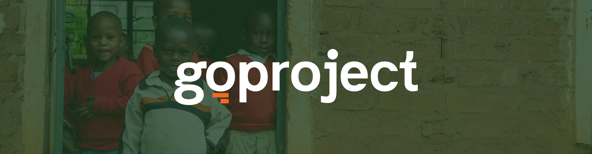
GO Project is a national nonprofit with a mission to strengthen families and ensure every child has the care they need. Over the years, the organization had grown significantly — expanding from orphan care into a broader ecosystem of programs operating under three distinct sub-brands: GO Project, CarePortal, and Strong Family.
The problem was that the brand hadn't kept up with the mission. Each sub-brand had drifted visually, messaging was inconsistent across channels, and first-time visitors couldn't quickly grasp what GO Project stood for or how the three brands related to each other. The organization needed more than a visual refresh — it needed a strategic realignment of how it communicates its why.
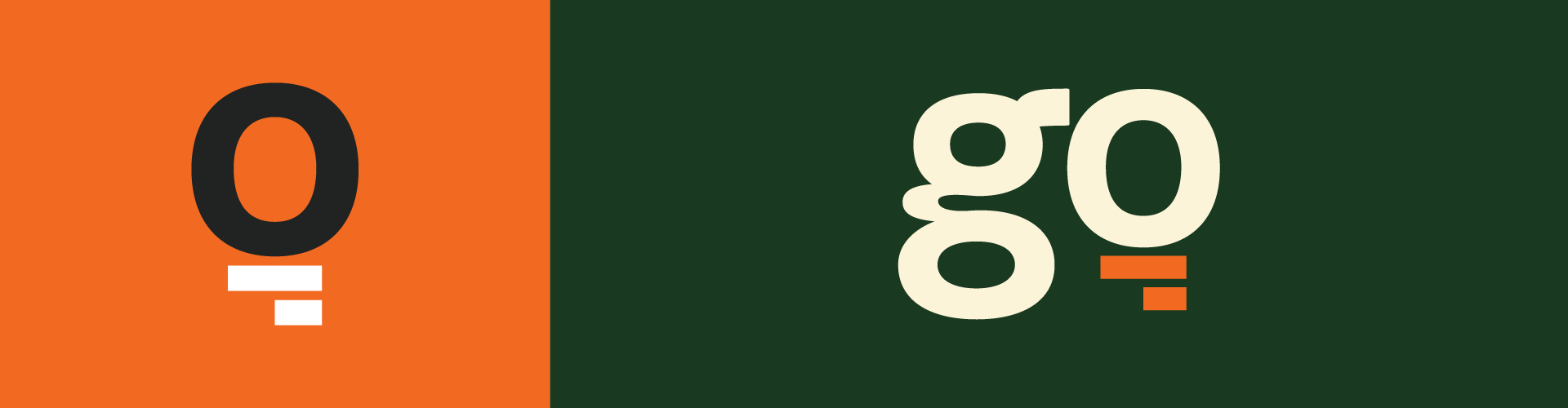
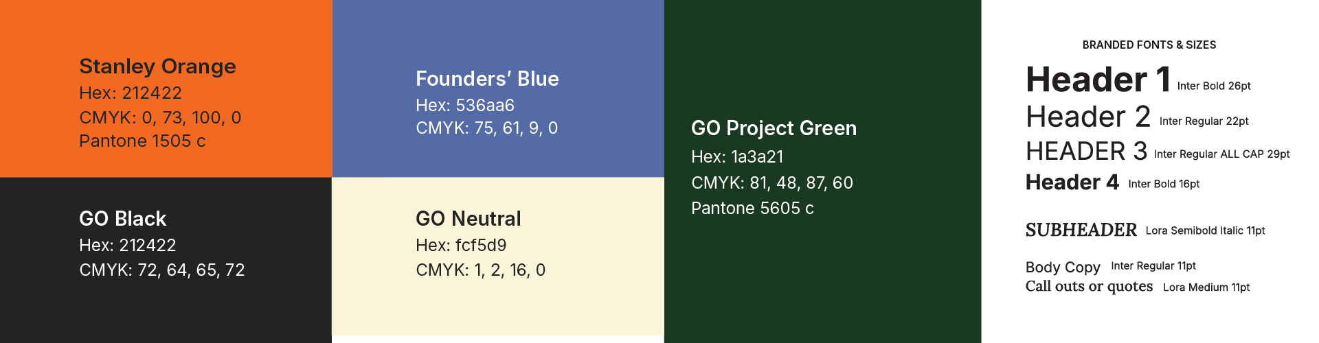
The central design challenge was hierarchy without homogeneity. Each sub-brand — GO Project, CarePortal, and Strong Family — needed to feel distinct enough to stand on its own, while clearly belonging to the same family. Too much uniformity and the sub-brands lose identity. Too much divergence and the parent brand loses authority.The solution was a shared visual DNA: a common typographic system, a color architecture where each sub-brand draws from a unified palette without overlapping, and a logomark approach that signals relationship without repetition. The result is a brand system where any piece of creative — a social post, a campaign mailer, a conference banner — is immediately identifiable as GO Project world, whether or not the parent logo is present.
impact block
Brand system unified across 3 sub-brands and 50+ touchpoints
Identity extended across 10 countries through the Strong Family launch
Design system adopted by internal teams, an external LMS agency, and development partners
Used as the foundation for two subsequent annual fundraising campaigns